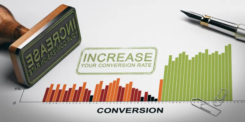
Conversion Rate Optimization is the method of optimizing your website or web pages for a better user experience with the ultimate goal of increasing visitors and converting them into customers (lead generation). Conversion happens when a visitor takes an action you want them to take.
The goal differs from business to business and can be something like sign up on your website, downloading an eBook, making a purchase and a lot more. When visitors don’t take the required action you want them to take or the bounce rate from your web pages/landing pages is high, it is a signal to start working on Conversion Optimization.
Today we’ll discuss about conversion rate optimization for landing pages. If your visitors are not clicking that call-to-action you want them to click, it is time you start working on conversion rate optimization of your landing page. Who can teach you the best techniques? Your successful competitors. See what tactics they follow to capture their visitors and take inspiration.
Read on to know the secrets of landing page optimization.
1. Writing crisp & relevant titles
The first thing that a visitors sees on your landing page is your title. A title should be crisp, brief and effective so that it captures attention easily. Visit your competitors landing page, if the title catches your attention in an instant, it means it is a good title.
When we say draw inspiration we don’t mean that you should copy and paste that title in your page. Study the use of words and structure of the sentence. Try to play with words for your own page. Come up with a list of titles and select the best one. You can even ask your friends which one looks better.
2. Creating Best minimalist landing page design
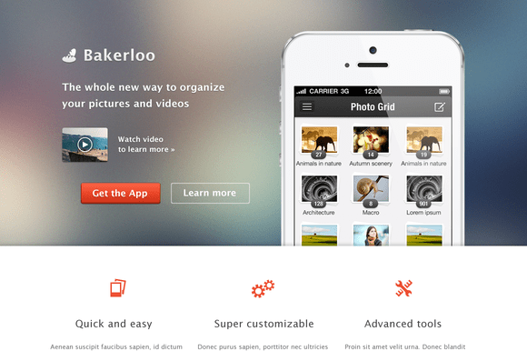
A landing page is usually an entry point for visitors. It is important to make it impressive, a poorly designed landing page will be a put-off. If your competitors landing page is free from meaningless clutter, has minimal but sufficient details then it surely brings business to them.
Make sure your landing pages are clean, don’t stuff them with unnecessary links that divert the visitor. Keep the layout organized with a lot of white spaces. Don’t compromise with information that is relevant.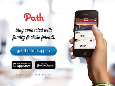
3. Using eye-catching images
Images are important when we talk about landing pages as it makes the page visually appealing. Your competitor’s landing page is impressive if it has a relevant and eye-catching image on it. The image that is in accordance with the theme.
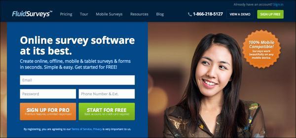
If the page has an image of a person then your competitor really knows his CRO. According to researchers, including a person’s image as associating photos of humans to landing page build trust and emotional connect. Adding a Picture of a Person Increases Highrise Signups by 102.5% says Signal Voice.
4. Using directional cues
After landing on to your competitor’s landing page if you involuntarily look to the sign box, chances are there that the landing page uses directional cues. These cues can be either arrows, pointers or they can be images of humans looking at the sign-up box.
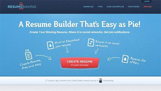
This happens as we are susceptible to follow arrows and cues. You must incorporate the use of directional cues as it has a major role in what we look at a page.
5. Defining value propositions clearly
According to studies ,it is shown that it take 3 seconds for the visitors to decide if they want to stay on a webpage or not. So you have only 10 seconds to let them know what you have for them and convince them to stay. When you visited your competitor’s landing page did it grab your attention? Did it convince you to stay on it and that too under 3 seconds? It comes down to what they were offering i.e. their value propositions.
It is important to identify your key value propositions, you should know what you are going to offer the visitors and why. Incorporating your key value propositions on a landing page is a task in itself. In a few points you need to tell them what you are offering, why is it useful for them and why should they choose you. Make sure you do it perfectly.
6. Using prominent Call-to-actions
One of the reason your conversion is poor is that you are not convincing the user to click the CTA. A call-to-action is a trigger for the success your goals. Make sure the call-to-actions are big, bold and bright. It should instantly grab visitor’s attention and make them click it.
Keep in mind that your CTA must tell the users what will happen when they click on it. Example, Get Your Free eBook Now, Get Pricing, etc. Go check your competitor’s landing page, if it is as per our description then you better be careful.
7. Leveraging social proof
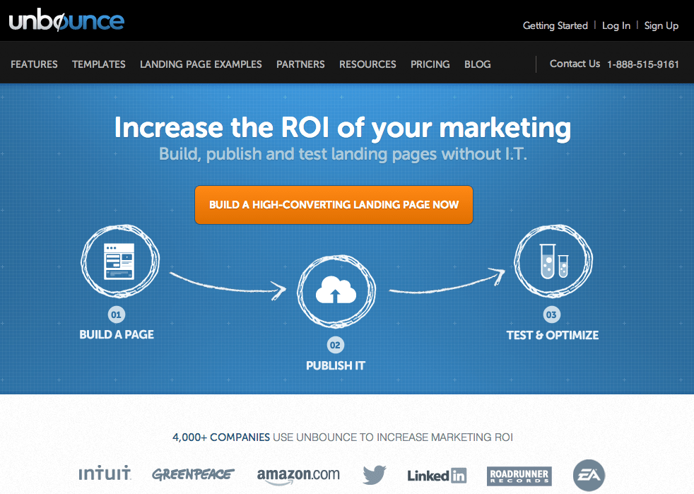
Social proof is a phenomenon where adopt actions of other people when they are not sure about the appropriate behavior for a particular situation. Smart marketers don’t leave a chance to leverage this phenomenon, as it is a powerful marketing tool that drives business by increased sales.
One reason that competitor is more successful than you is because he has placed a lot of positive reviews and elements of social proof on his website’s landing page. By doing this you are telling your visitors that they can trust on you as many other have trusted them too. Don’t believe us? Look at this Survey by Dimensional Research: 90% Of Customers Say Buying Decisions Are Influenced By Online Reviews. Don’t forget to add the best reviews on your page.
8. Keeping minimum form rows
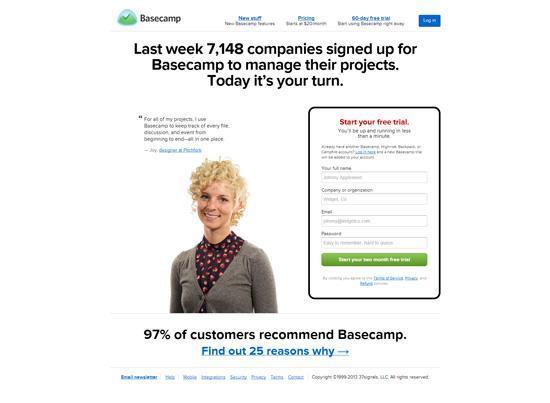
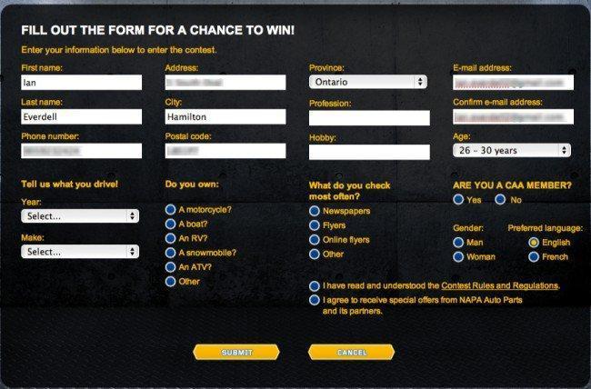
Form is the most important thing in a landing page. If you build a form that is too long and asks for unnecessary details, you not only test the patience of the visitor but you also make him doubt on your intention. Asking for phone number, address, date of birth in return of an eBook is a silly idea and no one will care to fill that form. You will only lose trust. Your competitor’s landing page accepts limited details then he will get more business than you.
9. Providing no navigation
When you visited your competitor’s landing page did you feel trapped? You couldn’t find any navigation links on the landing page so that you can go to another section of the website. If that is the case then believe us he is doing landing page optimization very well.
You should remove all navigation links from your landing page if you want to retain the visitor. This gives you the power to control the user and hence, there are increased chances of conversion.
10. Optimizing landing page for mobile
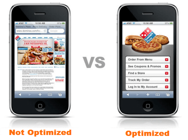
According to statistics: In 2017, figures suggest that more than 90 % of internet users will access online content through their phones. Check the landing page of your competitor through your cell phone, if it is optimized then the next lesson you need to learn is optimizing landing pages for mobile devices.
Non-customized landing pages will lower your conversion rate and increase your bounce rate significantly. Mobile usage is only going to increase over time, so you must incorporate responsive design techniques while building a landing page. This is going to help you target the entire bunch of mobile using audience who stumble upon your landing page. More business for you.
These were the 10 crucial lessons you will learn about increasing conversion rate by optimizing landing page on your website. We have made sure you don’t have to face these issue and you incorporate it before your competitors do and snatch away your leads. Always keep these pointers in mind while designing a landing page, if you want to win the trust of your visitors and convert them into customers.
To learn more about conversion rate optimization, you can enroll yourself in our advance digital marketing course in Jaipur.
What do you think about this article? Write to us in the comment section below. We would love to hear from you.
It will take a few seconds to share this article on social media. The sharing buttons are right here for you.
